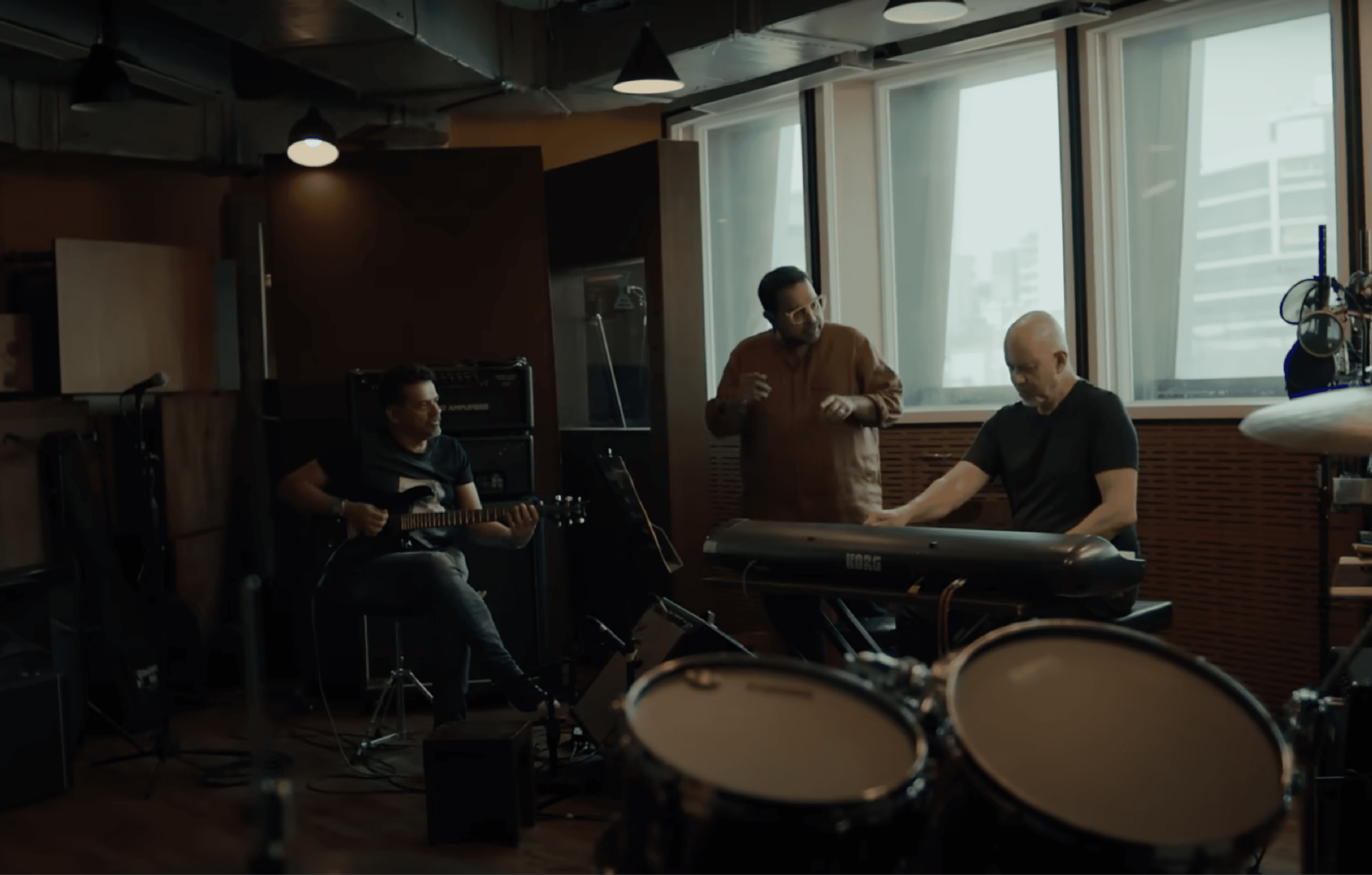
Feel the Music
26 Days Of FeelingsIndia’s new age Insurance brand needed a brand refresh to come across as more than a friendly, easy and trusted insurance provider, it needed stature. With more services than insurance, like Service centers and Clinics, ACKO is becoming a corporate that walks every step with the consumers and adapt according to their needs
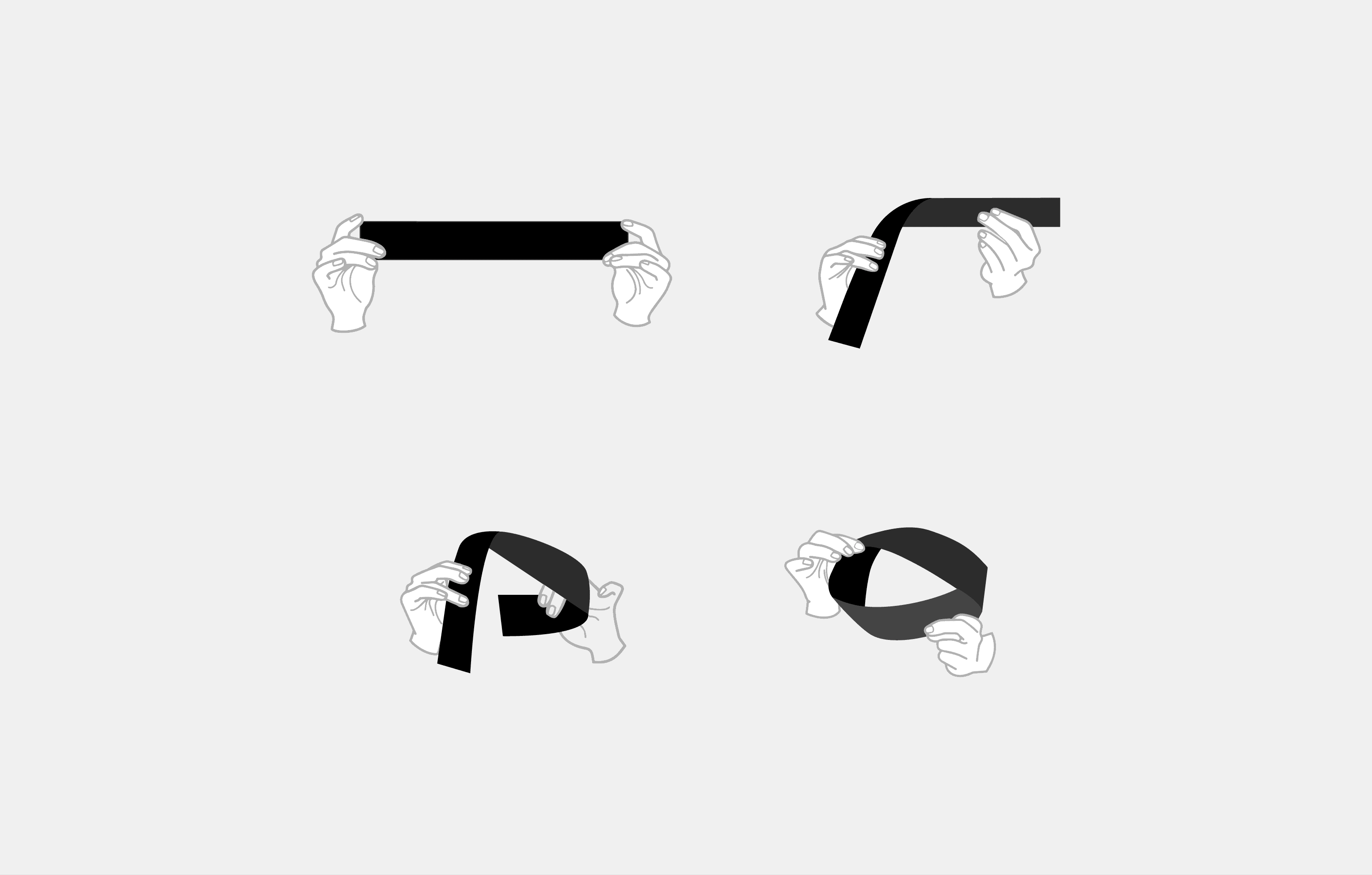
As an enthusiast about mathematics and physics, the dynamism of Mobius strip really resonated with the concept of thinking consumer first and being on one side. More so, the philosophical principles to a Mobius extend to the eternity, circularity and recycling which resonate with Mobius Strip.
As it is a very fluid shape which has many forms, literal and symbolic, we explored many shapes that it could take to balance its paper based moving shape and the structural geometry we needed. The three dimensionality of the logo came from the three shades of purple as it was important to show the paper has taken a twist and stuck on the two sides.
Project details
Client
ACKO
Project
Redifing visually and structurally
Year
2024
Services
Branding Art & Design Direction Motion Web Design
Credits
Website ↗ https://www.acko.com
India’s new age Insurance brand needed a brand refresh to come across as more than a friendly, easy and trusted insurance provider, it needed stature. With more services than insurance, like Service centers and Clinics, ACKO is becoming a corporate that walks every step with the consumers and adapt according to their needs
As an enthusiast about mathematics and physics, the dynamism of Mobius strip really resonated with the concept of thinking consumer first and being on one side. More so, the philosophical principles to a Mobius extend to the eternity, circularity and recycling which resonate with Mobius Strip.
As it is a very fluid shape which has many forms, literal and symbolic, we explored many shapes that it could take to balance its paper based moving shape and the structural geometry we needed. The three dimensionality of the logo came from the three shades of purple as it was important to show the paper has taken a twist and stuck on the two sides.