Brand Identity
Teach Hive
Overview
Teach Hive is a platform that connects educators to suitable workplaces. It aims to bridge the gap between the skill set and good market places. Moreover helps educators access to continuous professional development.
Approach
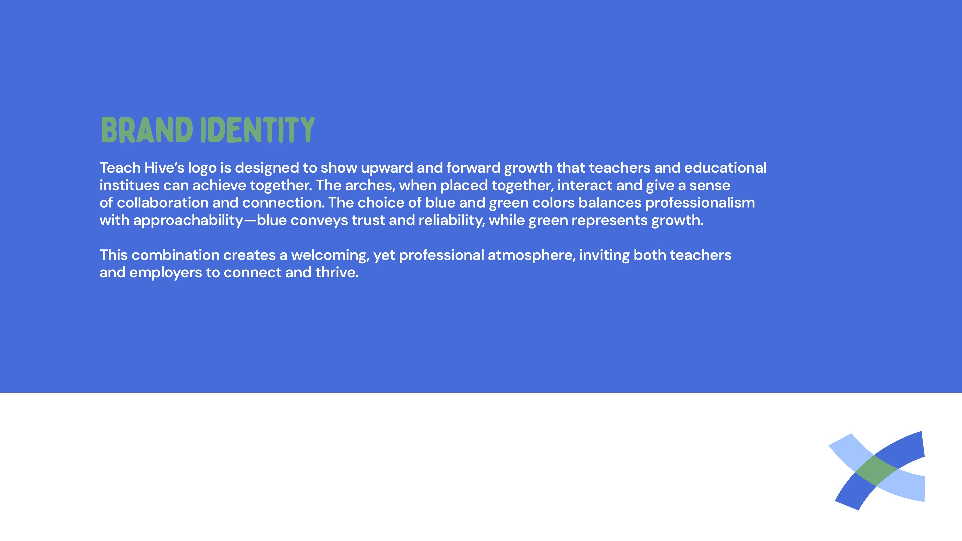
Teach Hive’s logo is designed to show upward and forward growth that teachers and educational institutes can achieve together. The arches, when placed together, interact and give a sense of collaboration and connection.
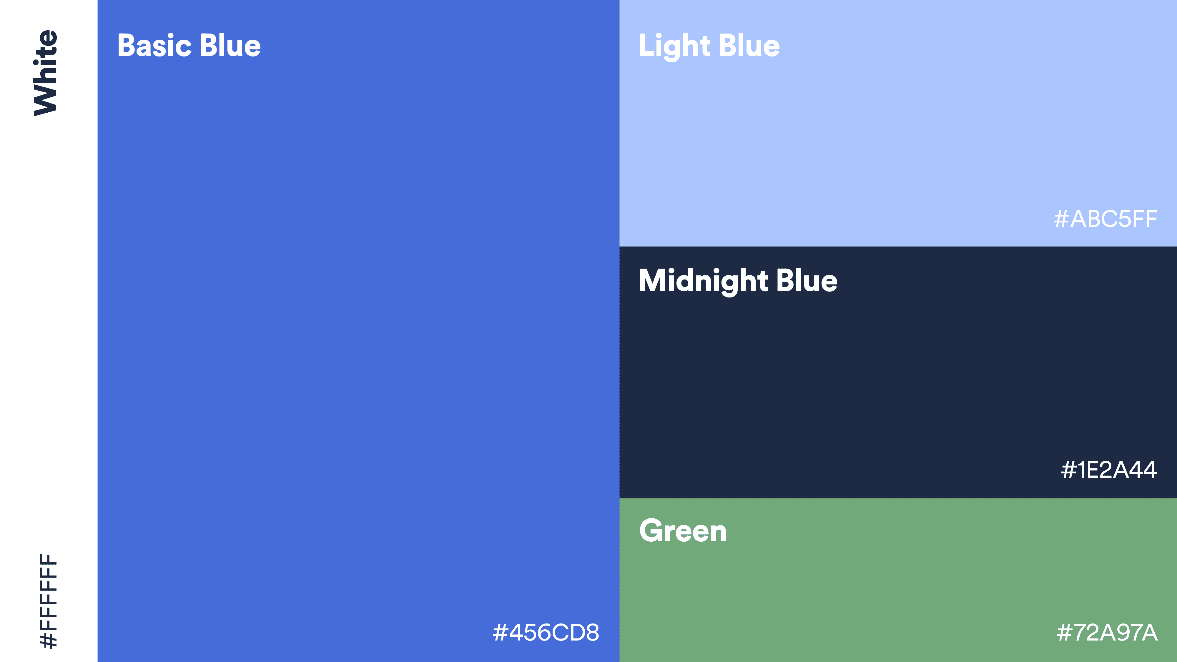
Colours
The choice of blue and green colors balances professionalism with approachability—blue conveys trust and reliability, while green represents growth. This combination creates a welcoming, yet professional atmosphere, inviting both teachers and employers to connect and thrive.
Personas
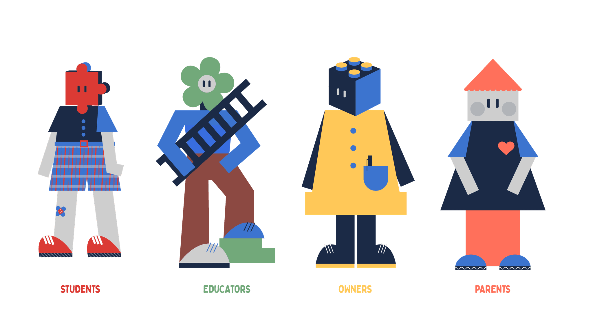
We wanted the user personas to be gender neutral and inclusive. So, we used metaphors for each of the personas. A jig-saw piece for students as they are always jumbled together and assemble when asked to.A flower pot for educators with a ladder as they facilitate growth for students. For school owners we went for a Lego block and made it quite large and boxy just like the structure of a school and finally a little house with a heart for parents who are the comfort and providers for it all.